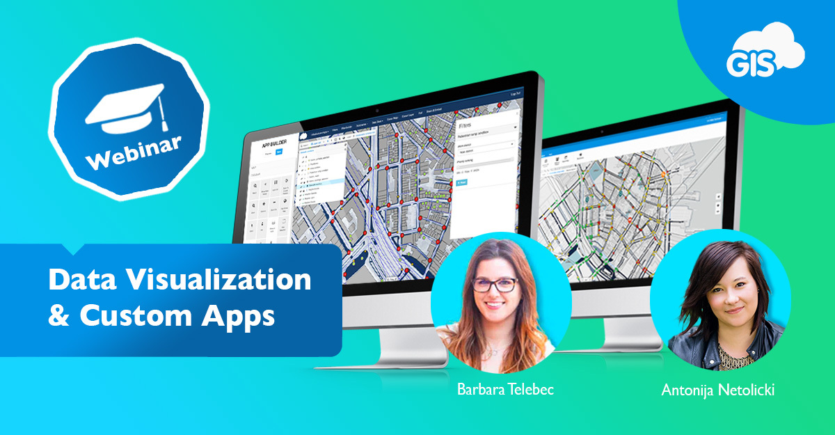
Have you ever looked at a map and immediately, from the get-go, were able to understand what the author wanted to show?
GIS allows us to interact with data more efficiently and make precise decisions and actions based on the representation of spatial data through maps. Data visualization is one of the crucial things you need to keep in mind when designing a map; unfortunately, that is often left as a back thought.
We wanted to share our best practices and advice regarding data visualization so that you can avoid sharing difficult-to-understand maps.
As a bonus, it’s always best to customize the interface to suit the viewer’s needs. On top of the visualization tips, we also wanted to show you how easy it is to white-label applications with the GIS Cloud platform. You don’t have any coding experience? No worries, we have you covered. Our App Builder will help you create a user-friendly interface all by yourself, and what’s best, you can change it if and when necessary.
Don’t take our word for it; check out our live webinar, where we go in-depth on both, and you will see that it takes less than an hour to get your maps and apps out for the end users.
If you want to try GIS Cloud apps and services, Sign Up for the free 14-day trial. You can also contact us directly, and our Solution Consultants are available to answer any questions.


